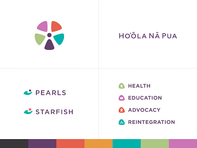
Ho‘ōla Nā Pua Rebrand
Recently completed a full re-brand for Ho‘ōla Nā Pua, an anti-sex trafficking non-profit based in Hawaii. I redesigned the main logo, and designed the 2 sub-brands and the 4 Core Pillars logos.
See old logo, full process and logo meaning on my blog:
http://siahdesign.com/archives/2106
Also, linking to PDF style guide.
Ho‘ōla Nā Pua means "New Life for our Children". Icon is meant to convey a flower with a girl being in the purple - and a starfish subtly portrayed in the negative space (see blog for significance of Starfish). The girl in the center of icon is surrounded by the 4 petals representing the 4 Cores of their Philosophy to bring new life to these girls: Health, Education, Advocacy, and Reintegration.
hoolanapua-styleguide.pdf
100 KB
More by Josiah Jost View profile
Like
