A BASIC Refresh
So, it's time again. @basic We are getting started on a refresh of our current site which was launched in 2014.
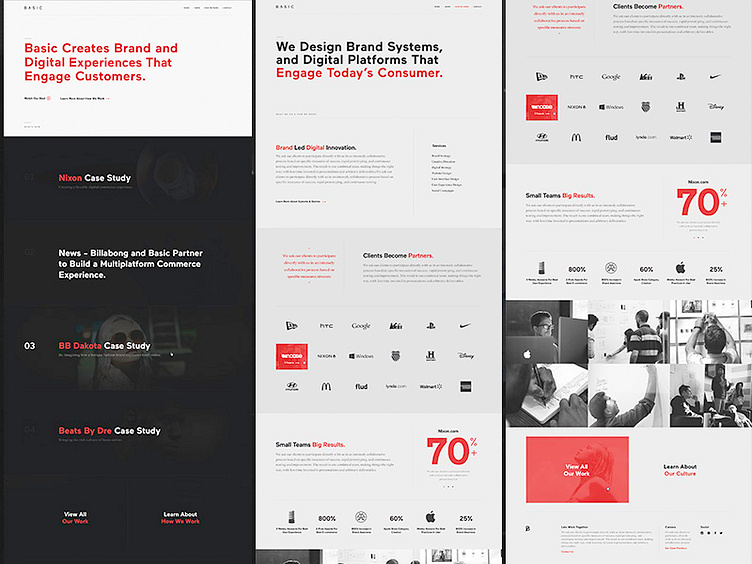
(Note: What you see above is older design directions from our 2014 site) -- It's been a super good run with our current design, which did exactly what we needed it to do. It won some awards and helped us tell our story in clearer way. But as with most agency sites it was just a part of the on going evolution of the agency itself. We are taking a step back and treating this like a real client project, with a full process of discovery, design and dev. We want to get deeper into what people really want from an agency site.
As we were getting started I took some time to go through all our old designs and found some nuggets that I thought would be nice to share. The above design was one of the original explorations. Ill be posting more explorations as the process goes on.
Ill be posting more stuff over the next year as the process goes on.
