Make It Pressable?
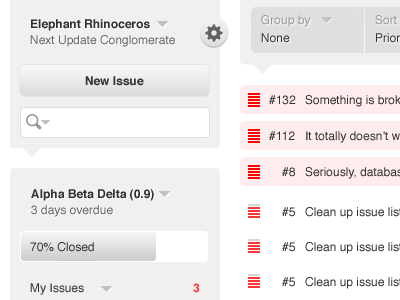
Maybe I'm off here, but I don't think the gear is apparent enough an indicator for revealing such a large list of even semi-important items. Perhaps the icon could look more pressable (slight raised like I've illustrated here)? If nothing else, it seems like this would help reduce the # of support tickets you have to deal with. :)
More by Jesse Gardner View profile
Like
