Thor Mechanical Logo Development
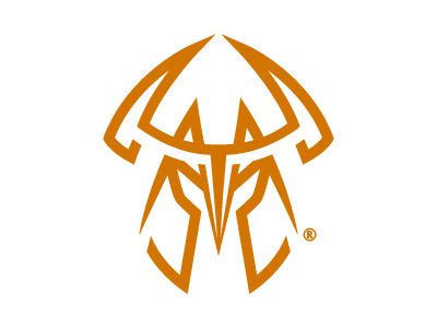
Hey guys, looking to get some feedback here: I'm working on a logo redesign for a pretty easy going client who is not necessarily "artistically inclined" (his words). His company is called "Thor Mechanical", and I wanted to have the "T" and "M" for a viking helmet. The feedback he's received from his friends and family is that it's "too detailed". Is there a way that I can simplify this more and make it less "detailed"?
Any constructive feedback is welcome! Cheers!