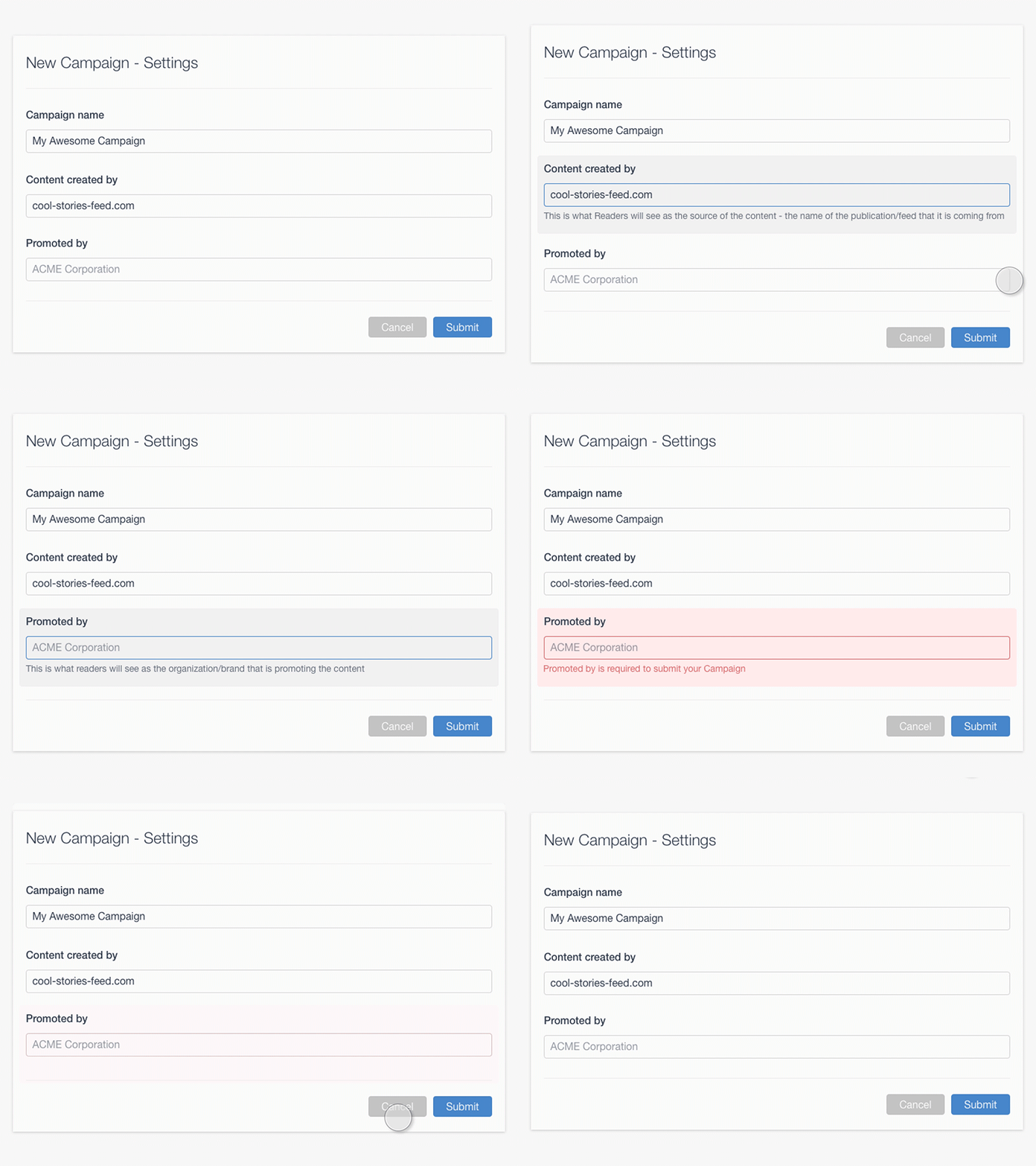
Hint on focus
We have lots of these small question marks near inputs in our forms, explaining some minor details.
So I thought of showing them right on focus to save user a click.
It's not a great UX, though, especially for often used forms, but couldn't keep myself from getting some fun, doing this quick prototype =)
"Cancel" interaction looks strange here, but wanted to have smoother loop.
More by Ivan K. View profile
Like
