DailyUI Challenge 004: Calculator Redesign
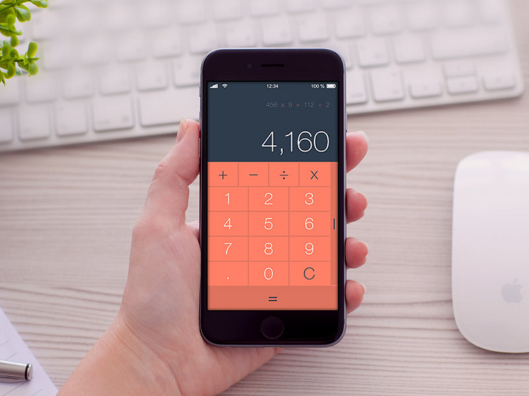
For the 004 Daily UI Challenge, I challenged myself to reimagine the iPhone calculator. I wanted this calculator to more closely resemble the phone keypad which I think users are more familiar with. This, along with a streamlined button layout (including the full width, large equals function) would make calculating much easier for users.
There is also a history of inputs at the top to help the user keep track of what they have already tallied.
Lastly, I provided an off canvas feature to the right for the more complex calculations that, let's just be honest, I never use.
More by Samantha Gibbons View profile
Like
