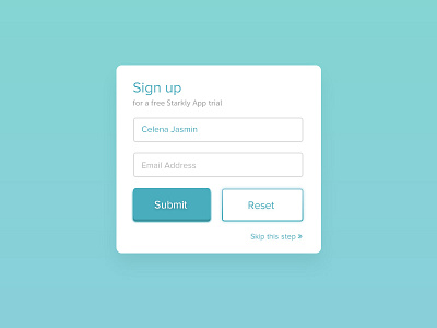
Sign up form - trial
Trying out how the Primary and Secondary Button styles look like when placed beside each other. I might remove the solid shadow on the primary button (left).
Feedback are always welcome! :)
More by Celena Jasmin View profile
Like
