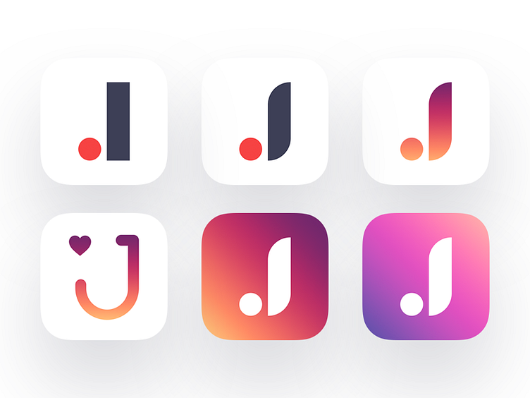
eCommerce App Icons
Hey guys,
Thanks for amazing feedback for previous Joom icons shot. It was very hard to read (the right word was JOOM) so I decide to find something different. "J" is very hard letter to designing. I really like the first option, 2,3,5,6 is evolution of it. Also I like one with heart, but maybe it's not looking good in small sizes?
What do you think?
More by Alexander Zaytsev View profile
Like
