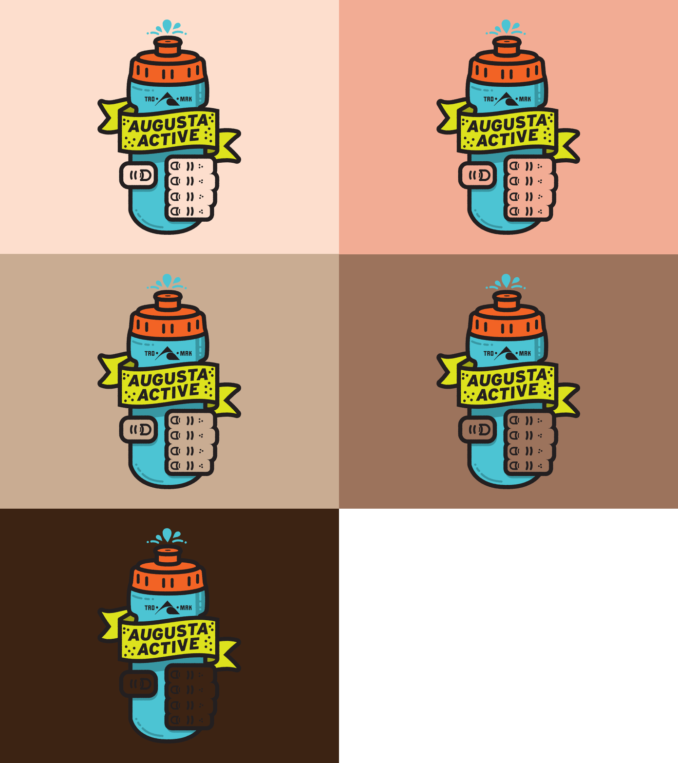
Augusta Active Temporary Tattoo
Took my concept of the "crush it" design and made it more to the http://augustaactive.com branding style. I wanted the tattoo to be able to show the color of the person's skin who would be wearing it and thought the hand would be the perfect place to do that. Definitely like how this turned out.
More by Lj Gay View profile
Like
