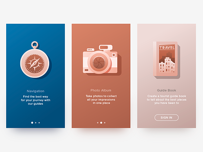
Travel App Tutorial
Hello dribbblers! Hope you day is going well! Today I want to share one more work with you here. The shot shows graphic design concept I have worked out for tutorial screens of the travel app. I was focused on keeping balance and harmony of visual elements such as illustrations, typography and color combinations. The main idea was to make the screens attractive and instantly informative to provide user with information in short seconds. Your feedback is highly appreciated!
Working with graphic assets for user-centered projects here in Tubik Studio we are always keen to get updated with the fresh news and practical case studies shared by design community. If you are interested as well, don’t miss the fresh issue of UI/UX Glossary focused on basic webdesign terms and supported with works by studio designers in Tubik Blog. Stay tuned!


