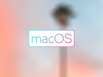
macOS Concept Icon – Round Iteration
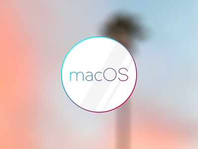

Here's the logo in a circular shape.
While the gradient is more iOS-like, the circle is more OS X-like. And I'm still convinced that Apple will drop the 'X' come WWDC `16.
Which do you prefer? Round or rectangular?