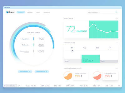
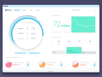
iShares - Dashboard
Happy Tuesday Dribbblers,
Still working on the iShare case study, I wanted to clean up the dashboard interface from it's original layout. The first iteration, I felt was a bit too busy, and I wanted to tone down the noise, creating ease of use. I feel this layout with the addition of the ticker feels cleaner and easier on the eye to follow.
Thoughts?
More by Greg View profile
Like

