Quick Glance - Mac OS UX improvement Concept
One of the things I have always wanted to have in Mac OS is the ability have a quick glance at an app (specially the calendar) without having to actually open the app.
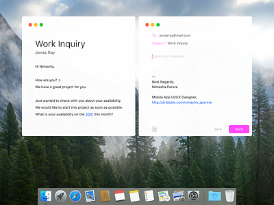
For an instance, when ever I get an email from a client or a friend asking about my availability on an upcoming date, specially at a VERY busy time or when I am in a hurry, I would like to have a quick look at the month without opening the app. At a time like that saving my self from even a one extra click feels like a huge time saver.
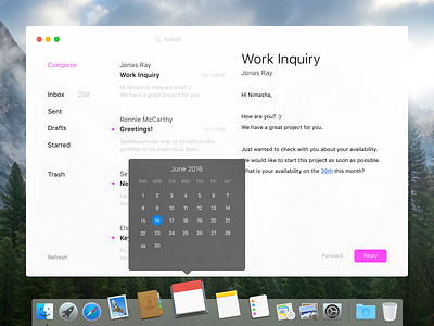
So today I decided to try a solution for my problem (using Calendar app as the example).
Rather than having to open the app and rather than showing the app name as a label when a user hover over the app icon on the Dock, showing the Calendar (for the current month) itself seemed more intuitive.
In my opinion, adding such a feature to the Mac OS will be a great UX improvement. Not only for the Calendar app, but for other apps too.
For example,
Hovering over Sketch App icon would show the open documents or/and hovering over a To-do app would give the user a quick glance at the upcoming tasks etc.
This is just my idea..
I would like to hear your ideas, comments on this as well :)
For better quality, check out the video


