Turner Broadcasting TNT Logo Concepts
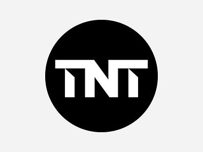
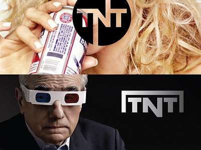
I've been meaning to post this for months. After I designed the new TBS logo last fall, Turner Broadcasting asked me to help refresh their TNT logo. You may recall their previous logo was simply a ruled circle with TNT set within the circle. They were fighting legibility issues when the logo was used at small sizes and wanted to improve on that but, if possible, stick with the ruled circle. It was my suggestion to move away from a ruled circle to a solid circle, increase the size of the text and explore simple, but custom treatments. They also wanted to see a couple completely different concepts not involving a circle. This logo here and the concepts in the attached file are a few of the concepts I presented. They ultimately did not go with one of my concepts but I suspect, based on the final design that has been in use for a few months now, that the final logo was possibly influenced by my concepts and I believe the internal creative staff at Turner ultimately put together what is now their new logo. The project was fairly simple in scope and the turnaround time was extremely quick. My contact was awesome to work with whom worked with me on the TBS logo. Anyhow, just thought I would share the experience and some of the concepts I delivered.

