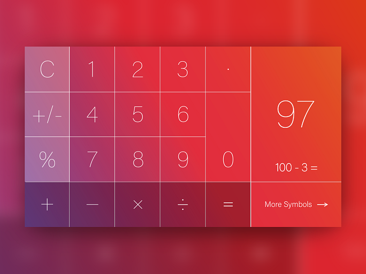
Daily UI: 4:100 - 'Landscape iPhone Calculator Layout'
Number 4 - Tackling iPhones landscape calculator layout.
Having evaluated iPhones landscape version of the calculator app, I think there's definitely room for improvement. With the additional buttons they add to the landscape version, it makes the user experience extremely hard to navigate, especially for someone with adult sized hands.
I feel the additional buttons they add on are not necessary as they're very in depth calculations to make and would not be used by around 70% of Apples iPhone users.
Therefore I have decided to re arrange the layout of the landscape version of Apples calculator app to be easily used for their users. I haven't removed the additional symbols, simply just added a button below the total number calculated.
More by Adam Sidaway View profile
Like
