Trello Card Selection Scenario
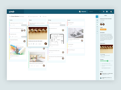
Now, I have the next shot ready from Trello Redesign project. The default card selection pop-over has been revamped, and it's now adjusted in the right sidebar.
The current scenario shows the Card Selection; when the card is selected, the right sidebar holds all of its details, with a navigator alongside to quickly jump over to different type of details including Description, Attachments, Checklist, Activity, Add, Actions, etc. I thought that pop-over was an annoyance, as it takes the user's attention away from the entire board.
Don't forget to check out the attached real pixels.
Press L to like the shot. If you have any suggestions, let me know in the comments section.
More by A Rahman View profile
Like

