Couchsurfing app - menu suggestions
This work was a little private project. I've been a loyal fan of the Couchsurfing project for over a decade.
While there have been a UI update since the introduction of the CS (Couchsurfing) mobile app, I felt motivated to play with some possible improvement directions.
Since this was only an experiment, I allowed myself to focus on a project with a limited scope: cleaning up & refreshing the CS / profile side menu.
After some (limited) research of the app's structure and main functionality, I've mapped options of reorganising the information architecture in the menu (while considering, to some extent, how this would impact the rest of the app architecture).
I've focused on 2 directions for an update:
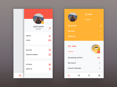
1. Maintaining the current access to the menu and the general architecture of the menu.
(on the left)
2. Composing a new architecture to support an experience that would fit better with the specific scenarios of CS users: surfing, and hosting.
Since this is the user profile menu, unlike in Airbnb app, where there are two completely separate modes of the app (hosting, traveling), here I have decided to include the relevant profile information of the two modes in a single, split, profile screen.
(on the right)
I continued to try a few style directions to clean up and lighten up the look & feel. Here I posted only 1 design option for each of the 2 UX design options.
Couchsurfing on ITunes:
https://itunes.apple.com/us/app/couchsurfing-travel-app/id525642917?mt=8
