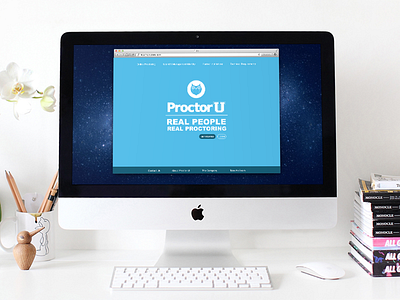
DailyUi Day 3: Landing Page
This one was tricky to pull off in a day (with working my regular job). Our current webpage at work is a little busy and I wanted to take a stab at cleaning it up.
I took all our elements from our page and made it as less busy as I could (some things I left out). I redid our owl logo to a more simplified look as well. Attached is what our site looks like currently.
#dailyui #003
Follow me at:
Instagram | Twitter | Facebook | Google+ | Thigpen Designs
More by Scott M Thigpen View profile
Like


