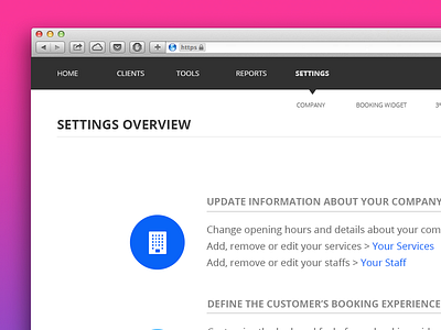
Settings overview
I think that the "Settings" is always the most neglected section of any software. It's the part that gets all the things "you-don't-know-where-to-put" that ends up here.
In this mockup, the idea is to clean up all unnecessary items and guide the users through a kind of summary of “where-to-do-what”.
There is 2 versions of the Settings Page. Feel free to tell me the one you like the most. Circles icons or Rectangle box...? :)
More by Louise Chang View profile
Like


