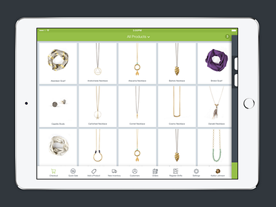
Shopify POS - iPad Concept
Sometime last summer I started spending some time thinking about the point of sale application for Shopify with a focus on mid-level retail stores.
This concept that was never taken through had a floating cart to the right of the screen, which allowed you to quickly manage your sale and have a bigger focus on the task at hand, instead of the current model which breaks your focus into two things at all times.
The introduction of a tab bar allowed a better view of your entire business quickly accessible at any time, and could be customized to change depending on what features you used. It would start basic and then expand as your business and your knowledge of the app grew.
The art direction of the app brought in more green, moving away from the typical blue we used for POS, and had more contrast with the darker cart elements.

