Redesigned UXPin - Case Study
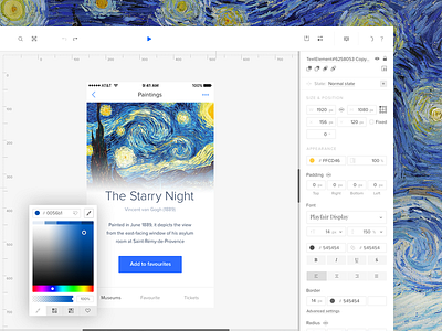
Like the Force, you can choose a light or dark version of our design editor. Here is the gleaming, futuristic white version. The editor’s clean aesthetic helps users easily locate the elements they need without having to hunt for them.
Full case study on Behance:
https://www.behance.net/gallery/37856221/Redesigned-UXPin
Press “L” if you like this!
And if you want to learn more about the redesigned UXPin, check out uxpin.com.
More by UXPin View profile
Like

