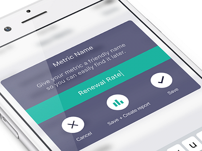
Save Dialog
I started out with iOS' standard alert dialog, but I had to work in three options instead of the regular two. After a complete overhaul, this is the result, where the user is encouraged to use the middle option, by using colour in its icon.
More by Hendrik Kleine View profile
Like
