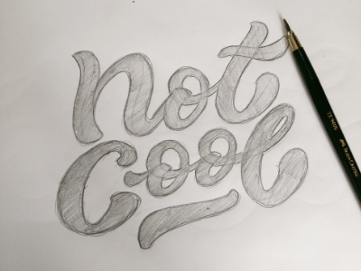
Not Cool
Current WIP - I need to make some alterations to the spacing between the letter forms and positioning of the words but I'm wondering if added swashes to the N and C would make the design more interesting - feedback is always appreciated :)
More by Tilly Goodier-Page View profile
Like
