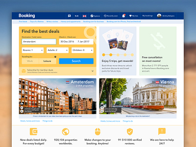
B.undle - Main Page
Finished main page for my Booking.com redesign concept project.
Press L if you like it : )
Whole page is attached to the shot!
I believe this one breathes new life into current Booking ui, still compared to all other redesign concepts I found over the net - it uses real data from real website as I know how all of the design decisions are made in such large companies (so some blocks seem to be quite similar for a reason). I believe designs must be driven not just by perfect visual experience but by data as well.
There also some cases, that can't really be shown within single image but I don't wanna bother you with all those small toggled states of elements from hidden layers. But believe me - I did thought about them too :)
@Booking.com Hey guys, hope you like this ; )

