Menu Items UI
When it comes to designing Menu for VR app. It is important to focus on its scalability part.
We took the idea from IKEA Kitchen VR (for Steam). You may have or may have not yet played the app. Their menu UI consists of 'nodes', think Mindmapping style.
What's lacking in this UI design, at least from our context is that, if you have more than 7 items, scattering around your controller, it will be a mess. Not scalable at all.
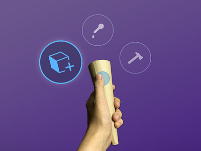
Here is one of our early UI mocks, utilising the Vive's 'radial touch' button. Our findings suggest that 2D windows panel is still the norm for presenting menu items.
Inspirations: SculptrVR, Modbox VR, and IKEA Kitchen VR