Fellowship One Android - Redux
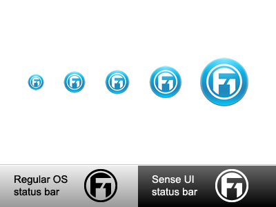
After talking it over with our other UX guys, and playing around with different rounded corners on the previous example, decided to go with a circular icon.
One interesting tidbit: iOS rounded corners are 33% rounded. On Android, rounded corners are 15%. Just an FYI, if you're doing an app for multiple platforms.
More by Nathan Smith View profile
Like

