The Haven
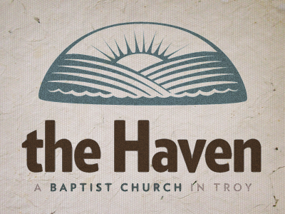
First attempt at a logo for a new church my dad started. It began as a sketch in my notebook. A few sticky points along the way:
- Those freaking lines. I now have a much greater appreciation for people who create line art. It's like trying to create a font... every tweak of every handle creates inconsistencies within the symmetry of the lines and drives OCD folks like me crazy.
- Creating water using negative space. I attempted to create an "inlet" to make it look more haven-like. Since those waves are for the most part created with negative space, it was tough trying to get definition against the lined hills.
- Typography. Had a very hard time finding the right font, I tried several script fonts at the request of my dad, but it ended up either feeling like a Resort or Farm. I think the relaxed mark needed a more structured font to pull it back from the brink of "Day Spa". Still not entirely satisfied with what I have here (Verlag Condensed Black).
