Superfine Holiday 2015
The 2015 holiday season kicks off Mohawk's celebration of the first 70 years of Mohawk Superfine.
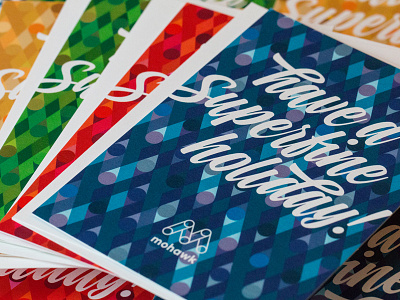
We wanted to create a holiday card that felt joyful and celebratory. Inspired by lush out-of-focus photos of Chicago Christmas lights, and using a pattern from Mohawk's brand standards, four different colorways were developed. The red, green, blue and gold patterns coordinate with stocked foil-lined Superfine envelopes.
The color palettes are intended to capture the illuminated and overlapping quality of holiday lights. The distinctive brush script typeface was chosen to balance out the rigid structure with some fun drama.
Of course, since Mohawk is a paper company, the cards serve as an important print demonstration for Superfine Layers. Layers is created by applying cohesive glue to one side of Mohawk Superfine cover-weight paper. After printing on an HP Indigo press the sheets were fused using standard print shop pressure. The resulting double-thick sheet has an impressive presence—combining the beautiful soft finish of Superfine and luxe thickness.
Addy Award Silver Award Winner | 2016
