Layout Tip #1
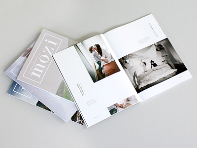
One of my favorite spreads to date.
LAYOUT TIP #1: If you have empty space that needs balancing out, duplicate a portion of one of the existing images and zoom in to create more texture and depth to the story. Here I took the part where the mom and son are holding hands to create a focal point.
More by Amber Asay View profile
Like
