Maggie Hyams Website - Mobile Comp
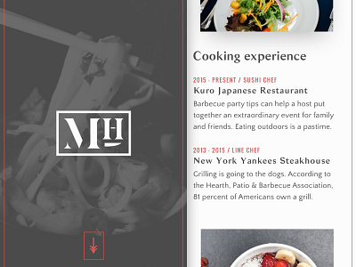
Taking a mobile first approach, the layout for my sister's website will be simpler than what you may have seen in my desktop comps. The left and right columns will stack, as well as the content within the right column. I plan for the left column to take up 100% of the viewport height, so the downward arrow also makes sense here.
The full comp is attached below. The iPhone mockup is courtesy of Jon Rundle.
More by Kyle Hyams View profile
Like

