Weekly Layup #6 - Voicey Deal Screens
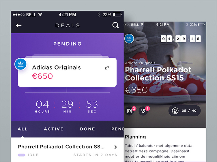
An early stage visual design for a deals overview page and deal detail page.
The left screen shows a couple of pending deals displayed as cards followed by a list view of deals this user has already accepted. Once a user taps on one of the cards, the right screen will appear in a subtle way.
View the attachments for more details and fine pixels.
Really curious about you guys opinion on this. Is the right screen still in line with the left screen? For some reason I have the feeling some of the elements might be out of place...
Cheers, Eelco
PS this is not related to adidas whatsoever. Simply using it for mockup/dummy purposes.
More by followilko View profile
Like
