Blog
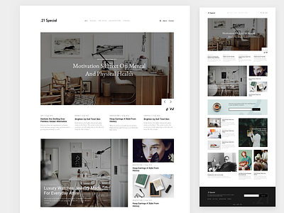
I continue to work on the design for the company blog. I think this one look more interesting and fresh. Focused on typography and content.
Grid: column width = 60px / gutter = 40px.
Cheers,
Roman.
More by Roman Slonov View profile
Like


