DC Comics - Logo Tweak
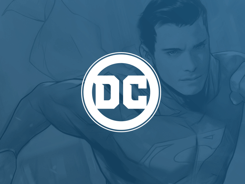
So, like some others, I was a bit disappointed with the updated DC Comics logo. I thought the general idea was solid, going back to the classic circle, but I felt it needed some refinement.
I increased the weight of the main stroke as well as added an additional thinner stroke to harken back to the classic DC Bullet logo. The balance and thickness of the two letters felt really off to me so I redrew them and simplified the "C" quite a bit. There are some other more minor tweaks but that basically covers it.
Hope you like.