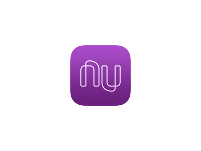
Nubank App Icon
I'm glad they update their app icon, but the new version has some flaws, which I fixed here.
The logo is now properly aligned to the grid, no more blurry pixels!
Replaced the gradient colors for a more natural look, resembling the credit card colors.
Applied a slight gradient to the logo, to make it less flat.
More by Davi Andrade View profile
Like
