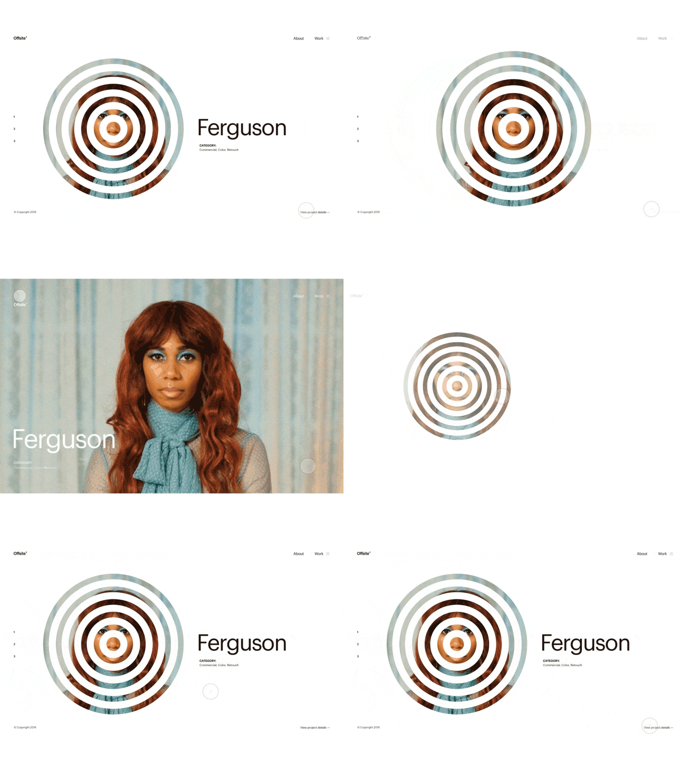
Offsite — Homepage Animation
Hi guys
This one is rejected proposal for the client I did few weeks earlier. The main idea was to relate client visual identity / circular shapes, with the visuals of work they do, and use it as a mask for the projects they do. This is animation between homepage and project details page and this animation made it look amazing. Big thanks to @Mario Šimić for helping me with this smooth animation, check his profile to see more great work.
Let me know what you think! :)
More by BORNFIGHT STUDIO® View profile
Like
