Porn Rock merch print design for theater show
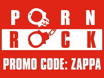
The play, “Porn Rock”, is a re-staging of the 1985 Senate Committee hearings. At these hearings, a group called the Parent’s Music Resource Center (PMRC) presented a series of rock album covers, rock music videos, and recited outrageously filthy and pornographic lyrics. The intent was to show that parents might not know what was on the records their kids were purchasing, so the PMRC wanted a warning sticker on the albums. This was opposed by musicians like Frank Zappa, Dee Snider of Twisted Sister, and John Denver, who testified at the hearings. The testimony was harsh, satirical and biting in place, although Denver was very respectful. The client wanted the design to reflect the major themes of the play and the hearings including the people involved, the constitution, the First Amendment, restriction of speech and handcuffs. The client also suggested the tag line and having the letter “O” in both words of the title be the loops of a set of handcuffs linked by a chain. The ultimate goal was to be bold, but not cluttered.
I designed the main graphics in Adobe Photoshop, Illustrator and InDesign. The title was created in Illustrator and inspired by the parental advisory explicit content stickers that were warning labels which was an effect of the PMRC hearings. Besides the obvious recognizable attributes, the bold typeface is perfect for posters and ads. Then using both Photoshop and illustrator, I created a composite of Dee Snider face on a cut out of Uncle Sam from JM Flag’s “I Want You” posters to recruit solders for the World Wars. Uncle sam is the personification of the American government and represents patriotic emotion. The initial idea started as a tribute to Jamie Reid’s notable cover art for the Sex Pistol’s God Save the Queen, which has been described as the single most iconic image of the punk era. I used the cutout style, monochromatic color scheme and halftone pattern. The other characters were designed to resemble a courtroom sketch with a splash of haphazard green watercolor.The character names were added in a beautifully drawn cursive handwriting script to add a personal feel to the illustration. Finally, the “Bad Idea” text from the tagline was designed in Illustrator with a rubber stamp-like effect reminiscent of recognizable censorship and top secret design aesthetics.
