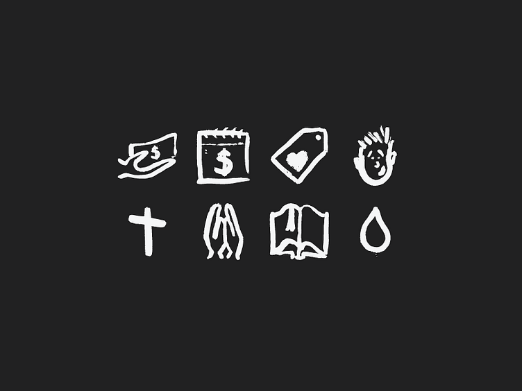
Non-Profit Icons
Worked out some hand drawn icons for a website we're working on over @Caddis. The overall design is one that really goes against every trend in web design these days. We're using a bunch of textures, vibrant colors and editorial style text layouts and it's created a really cool feel thus far. However the typical monoweight icons weren't getting it done so we went in this direction thanks to a little advice from @brianperez.
More by Lewis Communications View profile
Like
