UX Principles - 03
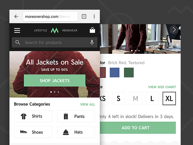
Here's a couple more screens from our work with Google earlier this year on defining best practices for mobile apps and sites. These screens are from a men's fashion app where we worked on best practices for providing users with clear utility up front and easy to navigate product pages.
More by Octopus View profile
Like

