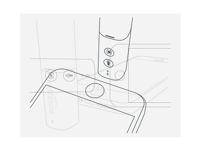
Positioning
To set up Dash with an iPhone, you have to point the phone's bottom speakers towards Dash's microphone... literally. How do you communicate that effectively so that the user doesn't have to wait a full 30 seconds to find out that the devices were not correctly positioned? That's the challenge I was given.
Here were the position variations and the illustrations I tested (see attachment). The project involved lots of trial and error, 3D line art illustration, prototyping, and plenty of hallway user testing. In the end, the work paid off. Can you guess which one succeeded?
A – Difficult to understand, audibly unreliable
B – Easiest to grok, audibly slightly unreliable (noisy kitchen appliances sometimes interfered)
C – Difficult to understand, but audibly very effective
D – WINNER – 2nd easiest to grok, and audibly very effective— yay!
Design D was an iteration based off C. I learned that when communicating physical orientations, having illustrations that matched the real word perspective of the user at the time of viewing is absolutely essential. Design C required the user to consciously consider the orientation of the illustrated devices in relation to the phone in their hand. By flipping the illustration perspective in Design D, the user could skip this step and quickly & confidently follow the given instructions.

