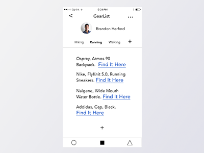
GearList UI, closer look
This is a close look at the GearList UI. I like raw link styles, just the blue and underline. I see these around here and there, and I think it can really keep the visual language simple and direct. Sometimes just a similar blue color communicates the same way.
More by Brandon Herford View profile
Like
