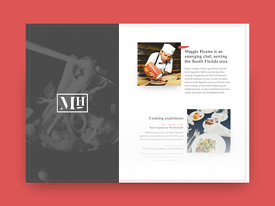
Maggie Hyams Website - Rebound

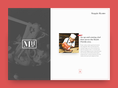

Decided to give this layout another pass, as I wanted more emphasis on the introduction. The arrow in the bottom right area will guide users down the page towards additional info. I also brought in Maggie's word mark to balance the negative space in the top right area.
Another element that you might notice is the introduction of a third typeface. It's only role is to call out time stamps and job titles. I'm being mindful of where it's sprinkled in so that the layout isn't too busy.
Check out the attachment of the comp in full. There you'll also see how I've comped the social/contact section. It's another nod to the traditional menu layout.