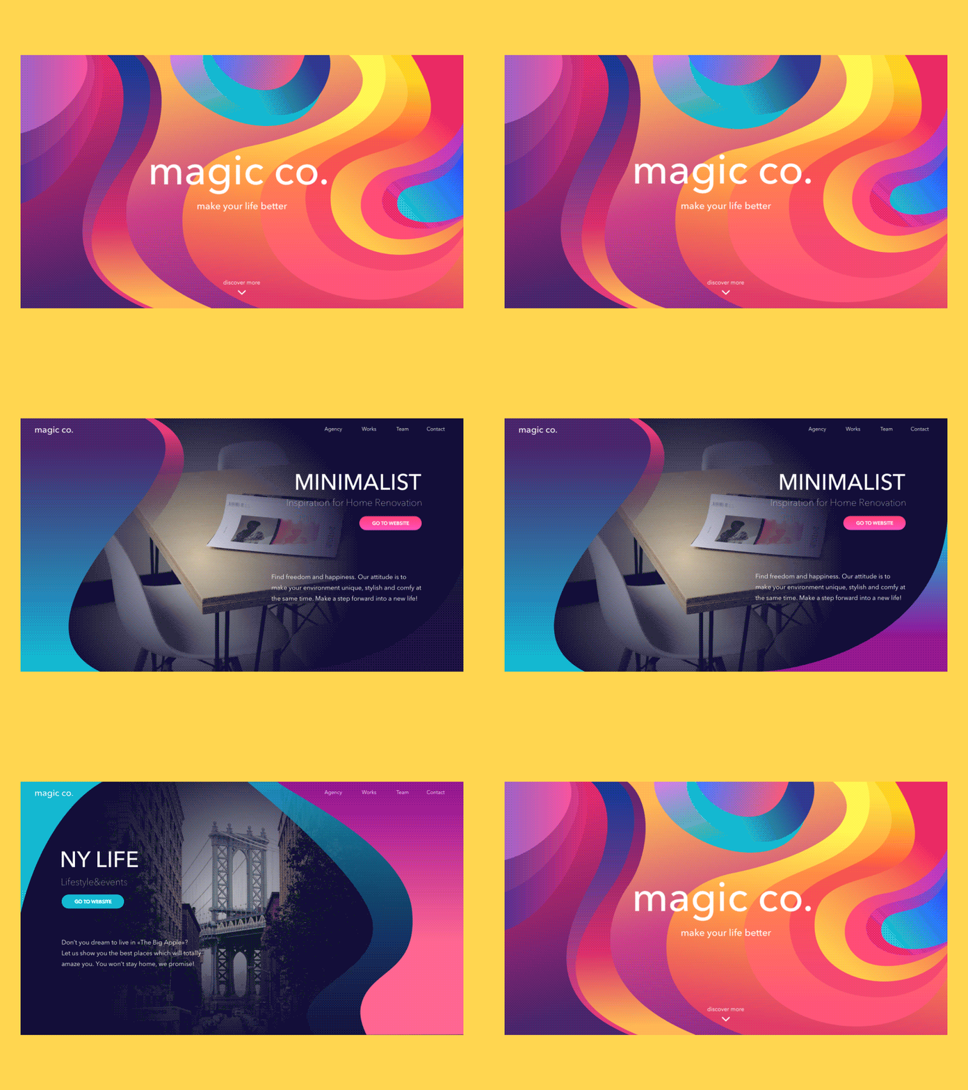
magic.co landing page concept
Hey guys! Ready to make your day brighter? I’m happy to share with you my new concept. This time it’s a website of the agency that presents its services. The variety of provided services is echoed by the variety of colors used in the interface. My aim was to make it lively, vivid and attractive, creating positive first impression and supporting positive user experience with engaging design solutions. Please check the video attachment in order to see the higher resolution as well. Hope, it will make your day more positive too!
Thanks to our motion designers @Kirill and @Andrey Pixy for their constant help and support.
Here in Tubik Studio, working on design concepts and projects, we follow the philosophy of making every element of layout and every design solution meaningful and visually harmonic. If you are interested in practical side of the process, don't miss the latest case study in Tubik Blog devoted to UX and UI design of SwiftyBeaver, a web application presenting the integrated logging platform for Apple’s Swift programming language. Have a bright day!


