Yoyo
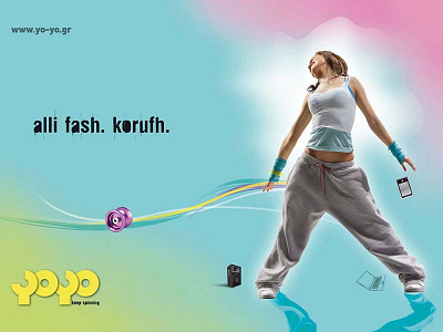
Logo design based on the toy itself. We used yoyo shape as a font for our logo. Simple and clean lines that will balance with the curvy moves of the performers. Floating graphics that follow the youth culture and language of the users.
Logo design based on the toy itself. We used yoyo shape as a font for our logo. Simple and clean lines that will balance with the curvy moves of the performers. Floating graphics that follow the youth culture and language of the users.