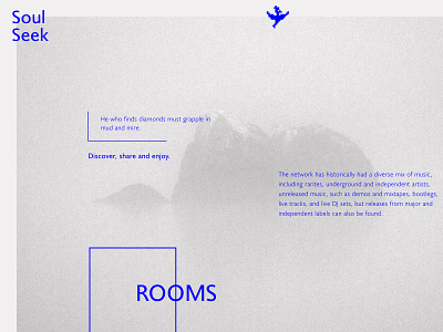
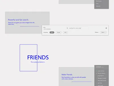
Soulseek - Landing page, refreshed and clear
I have just published a more in depth look at the amazing product Soulseek, which in my opinion it's in a serious need for a redesign.
This is how the landing page can be improved.
If you want to read the whole story, the why and how check out this post: https://medium.com/@agispas/soulseek-the-only-place-for-music-lovers-refreshed-7ed5c339046#.wnfc1haph
And don't forget to check the real pixels.
Thank you!
More by Alex Giuseppe Ispas View profile
Like

