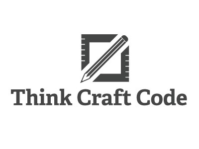
Think Craft Code - Logo V2
Here is my rebound shot of a collaborative design that I am doing with Andrew Houle. It's the logo for our new online design magazine. See his original post for more details.
I took Andrew's concept of the HTML tag and pencil and pushed the metaphors a bit further. We really want to focus on web design as a craft, so I thought it would be interesting to use the image of a square ruler to pull that out, and combining them with the angled brackets just made sense.
I also tweaked the pencil for more elegance, and tightened the spacing. This way, it recalls the HTML syntax, without having to actually mirror it exactly in terms of spacing and alignment.
Its back in Andrew's court now, and I think he'll be doing some more work on the typography.
More by Matt Ward View profile
Like

