#Exploration | Website Homepage
What i learned in this exploration
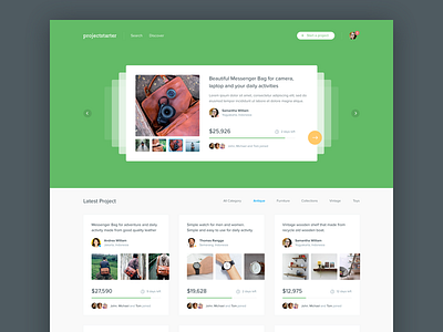
1. Using solid color without ornament as a header/hero section make the design looks fresh, as long the content not to crowded
2. Mistake in little card section. The title of each card didn't outstanding and i assumed that makes the user hard to scan the content of each card.
3. Another mistake in little card section. The main background very light almost white. and the background of the card is white with very smooth border. It makes hard to see the content of each card clearly
4. The CTA Button in card slider does not look like action button to go to detail of the card, but looks like a button to navigate next slide.
----------------------
Some images from: Oliobags's Instagram, Ghani's Instagram and some of them from google.

