ANSWER THE MUSE LOGO DESIGN: examples of process
My client was looking for a sample logo for his band, Answer the Muse and then wanted to develop it further. He requested a wordmark in a creative, artistic font that could represent the spiritually based rock band and stressed the need for the project to be a creative endeavor. He noted the band’s uniqueness and stated how they moved their audience and gave them an experience. He sent several examples of classic rock logos he liked including Aerosmith, Led Zeppelin, AC/DC, Metallica and the like.
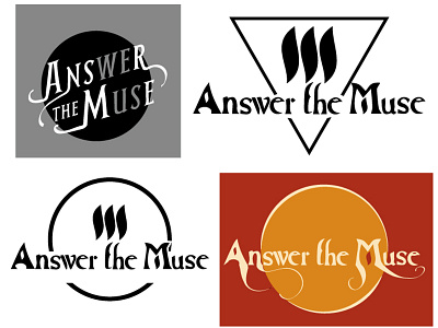
My first few ideas and iterations centered on this idea of band/fan interaction, and I toyed with ways of highlighting “we” in the word “answer” and “us” in the word “muse”. I considered Art Nouveau shaped letters as well as some modified Roman style typefaces inspired by the classic rock examples. However, the band preferred their current typeface; They just wanted it to be more unique. My client also stated he was fond of Ray Tabano’s winged “A” logo for Aerosmith. He also stated he’d like to do something with the flame shape in their current wordmark similar to the “A” emblem in the Aerosmith logo. With this feedback, I created a more organic version of their logo. Then I started working with a logo mark like the flame shape. I went with a theme of 3 in a row inspired by the bars of the Black Flag logo, but limited it to 3 because it made more of a flame shame as well as an “M” shape in the negative space (inspired by the negative space star in the Aerosmith logo). I also liked how there are 3 words in the band name. To tie everything together, I chose a triangle (also 3 sided). Likewise, triangles are often associated with some sort of spiritualness. From there we decided to replace the triangle with circle for more of a moon-shaped symbol and modified some scrolls from the letters. In the end, they decided against the negative “m” squiggle marks in favor of a more simplistic design.
