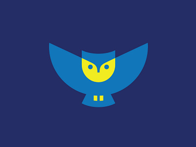
Owl Rebranding - 02
I have a chance to rebrand the owl mascot to look more clean, simple, modern and professional. All the shapes use basic geometry, and it can be easily converted to one color (see attachment). Still work in progress, any feedback or comments are appreciated! :)
app apps application
bird animal
brand branding identity
character
clean simple modern
cute
education school
geometry geometric
logo
mascot
night event
owl
View all tags
Posted on
May 13, 2016
More by Alfrey Davilla | vaneltia View profile
Like


