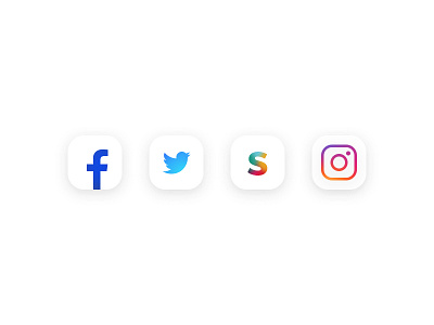
Facebook, Twitter, Slack, Instagram
Okay, so Instagram has a new branding but why so many people hate it? There is so many "redesigns" and "better" alternatives but the only one I like more than the official is this one. It's the same icon but with switched colors. It's more minimalistic and clean.
I don't want to create another alternative but I tried to make a few more icons in the same style instead. These are 4 apps I use the most and here is how they could look in the same minimalistic white style.
–––––––––––––––––––––––––––––––––––––––––––––––––––––––
Don't forget to follow me on Twitter, Behance, Instagram and check my latest startup project Smartmockups
I'm available for new cool projects!
More by Lukas Zajic View profile
Like
