Proposal
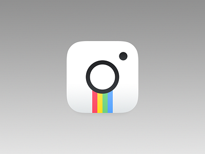
This is just a basic 5 min idea, but my gripe with the whole thing is that it actually takes 5 minutes for each take, sure the team did prolly 3-400 icons, and I'm curios why they didn't go with this kind of idea.
* You can see this in the video they made, just the lens and flash circles.
Makes all the sense right? And you lose that icon within an icon thing, right?
+ Why not go with the full black and white thing, but like leave the icons when tapped to be in color, for the UI i'd love to see that, it would still be colorful ( wasn't that the point of Instagram ) but still clear white with all of the text that's a darker tone.
This is just a rant post, not really trying to bring THE PERFECT SOLUTION, but can't blame a guy for trying :)
PS: Kinda weird my feed isn't overflowing with instagram icon redesigns, either people stopped doing that for likes, or this is just one hard as fuck pickle to tackle...
kthxbai
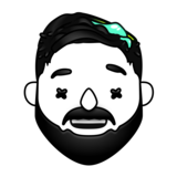
Also this icon above looks like a little "i" , just putting it out there :)